
I’ve discovered a new-to-me website for quick and accurate aviation weather! Users can look at a map and select the aviation weather at many more locations than are provided by Nav Canada’s websites.
The site is http://www.metar-taf.com and here’s a screenshot of the main page:

As you can see, there are dots of differing colors with letters in them. The coding works like this:
- Green V = VFR
- Blue M = Marginal VFR
- Red I = IFR
- Purple/Magenta L = Low IFR
- Black X = Unknown visual conditions, but known basic conditions such as wind speed & direction, temperature, and possibly altimeter setting, dew point and precipitation.
The left sidebar menu offers weather radar with the cloud and rain drops icon, and there’s a distance measuring tool just below it. Clicking the “Explanation” button at the bottom of the page provides a ton of informative data.
Let’s take a closer look. When you zoom in on the map, even more information appears in the form of small black dots and heliports, which are denoted by a circled H.
It’s important to understand the limitations of the dots and heliports. They’re most likely just local airports using weather info from the nearest airport with a METAR.
Some heliports actually have weather stations themselves that can offer some weather data.
If we zoom in and click on Calgary International, a side window pops up with basic info from YYC, such as wind, visibility, clouds and temperature.

Note that as you zoom in on the map, various airports show more clearly with their runway orientations displayed. Clicking on the compass rose on the side window brings up all the detailed weather info for YYC.
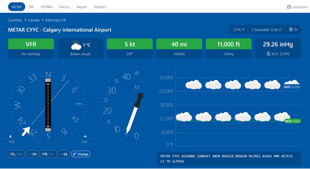
Now we have a fantastic visual representation of the most recent conditions at YYC. This display doesn’t offer up the temperature/dew point spread, but that’s easily found in the coded METAR just below, in this case 01/M12. You can scroll the page down and get all the relevant METAR data in both decoded text and tabular format.
At the top of the page there are buttons for TAF, NOTAM, History, Airport and Statistics. If you click on TAF it presents a wonderfully intuitive graphical display of the forecast weather for the station’s forecast period in local time, not Zulu time. This negates the need for mental gymnastics to figure out the time difference to Zulu. You may need to use the subdued slider below the TAF table to get the full forecast if it extends beyond the time shown.

You can instantly access NOTAMS near the top left of the page. Near the top right corner there’s the current station identifier with a drop down menu arrow. That shows a series of four nearby stations you can access.
As is typical of such sites and apps, metar-taf.com lacks graphical maps depicting fronts and systems. That’s because that graphical information is copyrighted by Nav Canada and NOAA/FAA. It’s still disappointing, though.
I’m a huge fan of making aviation weather simple and accessible. Presenting weather data graphically is just the easiest way to do that. This website offers up the best, most easily understood format that I’ve encountered.
The developers do offer an app which is available for a price on Android and iOS devices. Rather than pay for it, I’ve simply set a web icon on my phone’s home screen. It works brilliantly on my phone and tablet, as well as my home computers. Since it’s an ad supported site, you may want to consider using an ad blocker, which I’ve found works effectively.
There are lots more features of metar-taf.com that I haven’t covered, so I urge you to explore the site and see if it’s for you. I know that I’ll be using it regularly from now on.
