SkyVector
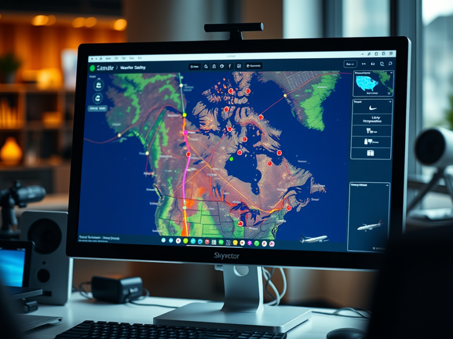
SkyVector is my favourite flight planning tool. Unlike Google’s products, it’s aviation specific so it speaks our language. To start, go to http://www.skyvector.com. It opens a map centred on a place called Mary’s River in northern Nunavut, but unless that’s where you want to be, this is easily remedied.
You can zoom out with your mouse wheel and drag to where you want to be, and then zoom in again. Or you can do it more quickly. At the top left of the screen is a box right below the SkyVector logo. Enter the airport ident code you want the map to show, such as CFX8, click on the GO button to the right, or hit enter, and the map instantly centres on your selection. Your screen should look something like this:
The most notable feature of SkyVector, unfortunately by its absence, is the map detail of regular Canadian VFR navigation charts (VNCs). I’m not sure when or if SkyVector will remedy this, but the lack of Canadian detail is the program’s biggest shortcoming as far as I’m concerned. There are some other features that really help make up for this fault, though.
A quick glance at SkyVector reveals it’s clearly geared to US users, but this is largely because the Americans make their data so much more readily available to services like this. I don’t know where Nav Canada currently sits on this issue, but I find it encouraging that Canadian pilots can now access the CFS from on-line providers. But more on that later.
Let’s look more closely at the real estate in front of us. To move around on the map is simple; click and drag, and use the mouse wheel to zoom. There’s also a zoom slider in the lower right corner if your mouse wheel is broken.
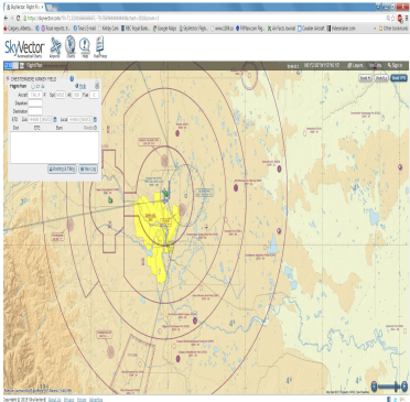
In the default view you’ll see coloured dots scattered all around. These are weather stations, either automated or manned. If you move your cursor onto one without clicking on it, it provides pop-up METARs and TAFs (if the station offers a TAF). Let’s zoom into Calgary International and activate the weather button. It looks like this;
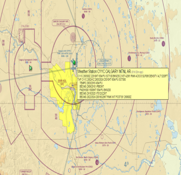
The colour of the buttons has meaning. Green means VFR weather, red or pink means IFR or close to it. Purple denotes automated stations. I confess that I don’t know what blue represents and I haven’t been able to find out.
SkyVector’s rendering of Canada is pretty good in some respects. It has excellent topographical detail, as though it uses the Canadian VNCs with nearly all other details removed. It also shows airspace boundaries and altitudes but doesn’t show all the airspace classifications. And as far as I can tell, it shows all the airports and nav aids that Canada’s VNCs display.
SkyVector also shows in default view any SIGMETs for Canada and the US, marked out as blue shaded areas; and any TFR areas, shown as red shaded areas, but only in the US.
Looking at the top of the screen beside the SkyVector logo are large icons for Airports, Charts, Help and Fuel Prices. To see details of Red Deer’s airport, for example we can select Airports and enter either the ICAO code for Red Deer, or the actual name. I find it best to just enter the code.
You subsequently get a pile of data similar to what you’d find in the Canada Flight Supplement. What’s missing, though, are things like the airport diagram as well as the Procedures and Caution sections found in the CFS. There are quick links to the default map view, a Google Maps view and an IFR chart view. Fuel prices are listed if they’re known.
For airports in the US, there is more information. There are links to the field’s complete Airport Facility Directory entry (equivalent to the CFS), a detailed sectional map, IFR charts and approach plates, and the Google Map view.
Let’s go back to the map. In the top right corner of the screen are a series of other links, buttons and information to explore. Zulu time is displayed, as is the lat/long set of the current centre of the map. The ‘Layers’ button shows tabbed menus for toggling weather features and fuel prices in various units and currencies. This is really useful for planning flights into the US, where fuel prices are much more widely shared, but it also shows some fuel prices in Canada.
There are also buttons that allow you to look specifically at certain maps. Centre the map on Seattle Boeing Field, KBFI, which is under some busy and complicated airspace. To make viewing this area easier, let’s look at the terminal area chart by clicking on the ‘Seattle TAC’ button in the top right corner.
Now you see an exact replica of the printed map with all the detail it provides, including margin and legend data. You can get frequencies for various facilities and information on MOAs and other airspace. These buttons can be really useful and it’s shameful that Canada’s maps are not yet available this way. Select the World VFR button to return to the default view.
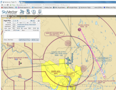
Let’s look at how to build a quick and simple flight plan. The easiest way is to move to your departure airport and right click over top of it. A small box appears asking if you want to select the airport, another nearby feature like a VOR or NDB, or a lat/long set as your waypoint. I selected Kirkby Field.
My next waypoint is Airdrie, so I move the mouse cursor there and right click on it and select the airport. A magenta line appears between my selected waypoints with a course and distance label. Note also the flight plan box in the top left corner of the map. More on that later. The maps looks like this.
It’s a simple matter to add and delete waypoints. Just right click on the next one and select it. It automatically gets added to your route and all required calculations are done for you. To delete a waypoint simply move the cursor to it, get the crosshairs icon and drag it a short distance. When you release the mouse button you have the option of setting this spot as the new waypoint or deleting it all together. Of course, this also allows you to move your waypoints around as you like.
You’ll notice that as you add waypoints to your route, they appear in the flight planning box. You can add or remove waypoints from here, too. You can also set your airplane’s speed, departure date and time, and simultaneously build a printable nav log. Just click on the Nav Log button to see your plan. It shows the route waypoints, distances and the anticipated durations of each leg based on forecast weather data along your route.
The best way to learn about building a route and flight plan in SkyVector is to access the video in the Help menu. Click on the Help icon at the top of the screen to get there. However, once you start playing with the program you’ll be surprised how intuitive it really is.
I recommend building an account and profile in SkyVector and adding your airplane’s details, which will make your flight planning nearly effortless.
As I said, I love this program, and the fact that it’s free is just another reason to love it and the Internet in general.
Next month we’ll conclude the series on free online flight planning resources with a peek at Fltplan.com and 100ll.ca.
